

Bluehost AI Builder Review: I Built a Real Website From One Sentence
#SponsoredByBluehost. Paid partnership with Bluehost: Bluehost paid me a flat fee to write this review, and I earn a commission if you sign up through my links. All opinions and screenshots come from my own build.
I build websites for a living. So when Bluehost asked me to test their new Bluehost AI Builder, my first question was simple: can one sentence really turn into a website I would show a client?
To find out, I built something real. Here in Colombia I spend a lot of time around small coffee farms, and many of them have no website at all. They rely on WhatsApp and word of mouth. So I asked Bluehost AI Builder to create a site for a small family coffee farm in Valle del Cauca that offers tours, tastings and farm stays.

In this review I’ll show you exactly what happened: the prompt I used, the question the AI asked me, the first version, a before-and-after chat edit, the booking dashboard it built on its own, and how I published it. It’s $0 to start, no credit card, so you can follow along and build your own while you read.
Try Bluehost AI Builder for free (I earn a commission)
Quick verdict: 9/10. Bluehost AI Builder honestly impressed and surprised me with how powerful it is. It understood my requests, took me from one sentence to a working site in about eight minutes, and made fine-tuning fast. I’ll be using it for quick projects for small businesses.
What is Bluehost AI Builder?
Bluehost AI Builder turns a plain-language description into a website or simple web app. You describe what you need in your own words, then refine the design, text and images by chatting with the AI while you watch a live preview.
There are no themes to install and no plugins to configure, and you don’t need to know any code. The process has five steps:
- Describe your website in a sentence or two.
- Refine it by answering questions and chatting.
- Watch it build in the live preview.
- Publish it with one click.
- Manage it later in the same conversation.
You can use it for business websites, portfolios, landing pages, blogs and simple web apps. Hosting is included on every plan.
Who it’s for: small business owners, freelancers, consultants, side hustlers and first-time founders who want to get online fast. If you sell services (tours, classes, consulting, repairs), it’s a natural fit.
Who it’s not for: Bluehost AI Builder doesn’t support ecommerce yet. If you want to sell physical products online, Bluehost has a separate product for that: Bluehost AI Store (I earn a commission).
I tested it: from one sentence to a live website
Step 1: Describe your idea (no sign-up wall, no credit card)
You start right on the Bluehost AI Builder page, in a box that says «Describe it in your own words.» This is the exact prompt I typed:
«A website for a small family coffee farm in Valle del Cauca, Colombia, that offers farm tours, coffee tastings and simple farm stays for travelers.»
You can also add your logo, photos or a site you like (PNG, JPG or WebP, up to 5 MB each). I attached the farm’s emblem and a simple brand style guide, and the AI used both: the emblem appears in the header and the colors follow the guide. After that you create an account with Google, Apple, GitHub or email. Bluehost never asked me for a card.

Step 2: The AI asks a clarifying question
Before building, Bluehost AI Builder asks follow-up questions when it needs more detail. In my case it asked just one, and it was a smart one: «How should travelers book tours and stays?» It offered three options: a request form with payment at the farm (recommended), a request form with an online deposit, or just contact details. I picked the recommended option.
These clarifying questions are free; they don’t use any credits. As a web designer I liked this part a lot. It’s the same discovery question I would ask a real client, just faster.

Step 3: Watch it build
Then the build starts. A checklist shows what the AI is working on: setting up the site’s look, adding tours, tastings and stays, building a dashboard, and building the pages. It «keeps going if you leave,» so you don’t have to watch. While it worked, it also asked me four quick optional questions about who I am, to tailor tips and next steps.
At times it took a moment to process, but the wait was never significant. I typed my prompt at 4:10 pm and had a full first version at about 4:18 pm.

Step 4: The first version
The result went well beyond what I expected from one sentence. My «El Cafetal» site came out in a deep coffee-leaf green with the farm’s emblem, and it included:
- Six pages: Home, Experiences, Gallery, About, Contact and Request a visit.
- An Experiences page with two tours, two tastings and three farm-stay options, each with its own duration and price.
- A request form for tours, tastings and stays, with payment at the farm, as I had chosen.
- A FAQ section («What should I wear?», «How do I get there from Cali?», «Are kids welcome?»).
- A Contact page with a form, opening hours and an embedded map of the area.
The whole first build used just one credit. I also appreciated an honest detail: the AI clearly marked the address, phone number and hours as samples, and told me where to change them.

The surprise: it built a booking dashboard too
This is where Bluehost AI Builder really surprised me. Next to the website, it created a private dashboard for the farm owner. It shows pending visit requests, upcoming confirmed visits and new messages, plus a list of the next visits with their status. You sign in at /admin/login. That’s not just a website; it’s a small web app for running the business.

Step 5: Before-and-after chat edit
Instead of dragging blocks around, you just ask. I typed: «On the Contact Page, create a hero image of a happy family, smiling in nature, harvesting coffee grains, in the golden hour.»

The Contact page now opens with a full-width photo of a harvester picking coffee cherries in the sun, under the headline «Come harvest with us» in a green framed panel. The AI was also transparent: it explained that it can’t create new images, that its photo library had no family harvest shot, and that it would swap in my own family photo if I sent one. One more credit used.

Step 6: Check the mobile view
Every site Bluehost AI Builder creates is mobile-responsive. In the builder you can switch the preview between desktop and mobile with one click, which matters a lot here in Latin America, where most visitors will see your site on a phone. In my test there was no separate tablet preview, but the layout adapted cleanly from desktop to phone.

Step 7: Publish
When you click Publish, you get three choices: buy a domain, connect a domain you already own, or publish for free on a Bluehost subdomain. On the Free plan, the subdomain is generated automatically. Mine is here:
It works and went live instantly, but it’s not an address you’d print on a business card.

In the project settings you can see the live address and connect your own domain later. Connecting your own domain requires a paid plan.

The final result
Here’s the full Experiences page as it was published. Everything you see, from the copy to the layout and prices, came from my one-sentence prompt and one clarifying answer. The prices are sample values I would replace for a real farm.


What about SEO?
Bluehost AI Builder generates page titles, meta descriptions, headings and image alt text automatically, which saves beginners a lot of work. Keep in mind that no website builder can guarantee rankings. Where you show up in Google still depends on your content, your location and your competition.
Bluehost AI Builder pricing and credits explained
Bluehost AI Builder is $0 to start, no credit card, with paid plans from $20/mo. Here are the four plans (USD, billed monthly, checked November 2026):
| Plan | Price | Credits | Best for |
|---|---|---|---|
| AI Builder Free | $0, no credit card | 5 a day, up to 30 a month | Testing and publishing on a Bluehost subdomain |
| AI Builder Lite | $20/mo | 100 a month | Your own domain, occasional changes |
| AI Builder Standard | $40/mo | 200 a month | Frequent changes |
| AI Builder Pro | $80/mo | 400 a month | Several websites |
How credits work
- One chat message uses one credit.
- The AI’s clarifying questions are free.
- Hosting never uses credits.
- Monthly credits and top-ups expire after 30 days.
- Top-ups come in packs of 50, 100 or 200 credits, starting at $15.
What happens at zero credits? Your website stays online. Only new changes pause until your credits refresh or you top up. That was my biggest worry with usage-based pricing, and the answer is reassuring.
How far do 5 daily credits go? Further than I expected. My whole build, including the first version and one chat edit, used only 2 of my 5 daily credits. My tip: plan your edits and group related changes into one clear message.
The Free plan is enough to build, publish and test a real site. You’ll want AI Builder Lite ($20/mo) when you’re ready for your own domain, which looks more professional to customers.
See current Bluehost AI Builder plans (I earn a commission)
Pros and cons
What I liked
- A real, working site from one sentence in about eight minutes, for $0 and no credit card.
- It understood my requests accurately, and the clarifying question was genuinely useful.
- It built a booking form and an owner dashboard on its own: more web app than website.
- Chat editing is fast for fine-tuning, and the AI explains what it changed.
- Very credit-efficient: 2 credits for my whole test.
- Honest by default: sample data is clearly labeled.
- Your site stays online even if you run out of credits, and hosting is included.
What could be better
- It can’t generate new images; it relies on a stock library or your own photos. Some stock picks didn’t match the setting (a few farm-stay bedrooms looked more suburban than Colombian), so plan to use real photos.
- The free subdomain is auto-generated and hard to remember. Your own domain needs a paid plan (from $20/mo).
- No separate tablet preview, only desktop and mobile.
- Occasionally a bit of internal technical text showed up in the build progress list. Minor, but noticeable.
- No ecommerce yet; for selling products you’ll need Bluehost AI Store.
Is Bluehost AI Builder right for you?
Choose it if you run a small business, freelance or offer services, and you want a professional website this week without learning WordPress. Think tour operators, coffee farms, yoga teachers, consultants, photographers or local restaurants.
Look elsewhere if your main goal is selling products online. In that case, go straight to Bluehost AI Store (I earn a commission). And for very custom projects, Bluehost Professional Services can finish or extend a site as a separate paid service.
A note from a web designer: Bluehost AI Builder won’t replace thoughtful design work for complex brands, but for small businesses that need to get online fast, it’s a remarkable starting point. It handles the structure, copy and booking logic in minutes, and leaves you free to focus on real photos and the final details. I’ll be using it for quick projects for small business clients.
FAQ
Is Bluehost AI Builder really free?
Yes. It’s $0 to start, no credit card. The Free plan gives you 5 credits a day (up to 30 a month) and publishes your site on a Bluehost subdomain. Paid plans start at $20/mo.
Can I use my own domain?
Yes, on the Lite, Standard or Pro plans. The Free plan uses an automatically generated .app.bluehost.ai address.
Do I need to know how to code or use WordPress?
No. You describe what you want and refine it by chatting.
Can I build an online store with it?
Not yet. Bluehost AI Builder doesn’t support ecommerce. For selling products, Bluehost offers AI Store.
Will my site go offline if I run out of credits?
No. Your published site stays online; only new changes pause until your credits refresh or you top up.
Can I edit my site after publishing?
Yes. You change the design, text, images or layout in the same conversation, review the updates, and publish again.
Final verdict: 9/10
Bluehost AI Builder impressed and surprised me with its power. From a single sentence it produced a six-page site with a booking form and an owner dashboard. It understood my requests and let me fine-tune by chatting, and the whole test used just two credits. The weak spots are images (bring your own photos) and the free subdomain, but neither stopped me from getting a real site online in minutes.
For a small business that needs a clean, mobile-friendly website without code, it’s one of the fastest ways I’ve found to go from idea to live site. And because it’s $0 to start, no credit card, the only real cost of trying it is a few minutes.
If you build something, tell me in the comments. I’d love to see it.
Build your website with Bluehost AI Builder (I earn a commission)
#SponsoredByBluehost

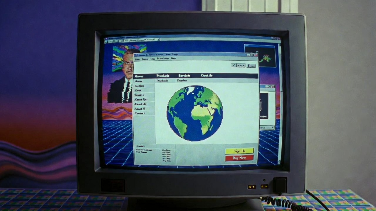
La épica (y a veces vergonzosa) historia del diseño web en 2 minutos
Todo empezó en 1989-1991, cuando Tim Berners-Lee (el papá de la web) creó la primera página en el CERN. Era básicamente un bloc de notas con enlaces azules y cero gracia. Fondo blanco (o negro en algunos navegadores), texto Times New Roman y la ambición de conectar toda la información del mundo.
Utilidad: revolucionaria.
Diseño?: brillante por su ausencia.
Llegaron los 90 y el internet se puso… creativo (léase: caótico).
- Aparecieron las tablas anidadas dentro de tablas dentro de tablas (como una suerte de meta-matrioskas del infierno).
- GIFs parpadeantes de “Under Construction” con obreros cavando (todos los sitios parecían una obra pública en Madrid).
- Fondos con patrones de ladrillo, estrellas giratorias y “best viewed in Netscape 4.7”.
- Fuentes Comic Sans para ofender a nuestra psique y márgenes de 3 píxeles de ancho gritando “¡Mira mi control del CSS!”.
1997-2003 → La era del “Flash” Sitios enteros hechos en Flash. Intros de 3 minutos con música tecno de los 90, botones que explotaban al pasar el ratón y la frase mágica: “Skip intro”. Si tu PC no tenía 512 MB de RAM, simplemente estabas vendido, llorando en silencio.
Luego vino la Web 2.0 (≈2004-2010) y todos descubrimos que podíamos tener sombras, brillos, esquinas redondeadas y gradientes horribles. Todo era azul cielo, iconos 3D brillantes y tipografía gruesa. Parecía que el mundo entero había descubierto Photoshop al mismo tiempo.
2010-2015 → Responsive design al rescate De repente los móviles existían y las webs de 960 px de ancho se veían como un elefante intentando sentarse en un monopatín. Ethan Marcotte dijo “¡basta!” y nació el diseño responsive. Las webs empezaron a portarse bien en cualquier pantalla… más o menos.
2016-2022 → Minimalismo, tarjetas y hero images gigantes Fondo blanco, tipografía sans-serif enorme, mucho espacio negativo y fotos de gente sonriendo mirando al horizonte mientras toman café. Todo muy HIPSTER.
2023-2026 → Glassmorphism, neomorfismo, dark mode y microinteracciones. Ahora las webs parecen interfaces de iPhone futuristas, con transparencias, bordes suaves, animaciones sutiles…
Pero seguimos discutiendo si el scroll infinito es normalidad o un crimen de lesa humanidad.
Moral de la historia: El diseño web pasó de ser un documento académico aburrido a una fiesta psicodélica de GIFs, luego a una obsesión por el brillo, después a minimalismo zen… y ahora parece que queremos que todo se vea como una visión psicodélica de Steve Jobs.
¿Y mañana?
Si debemos creer a los gurús de la tecnología (algo que yo no os recomendaré jamás, por cierto) probablemente vayamos a las primeras interfaces neuronales…
La pregunta es… ¿usarán COMIC SANS?
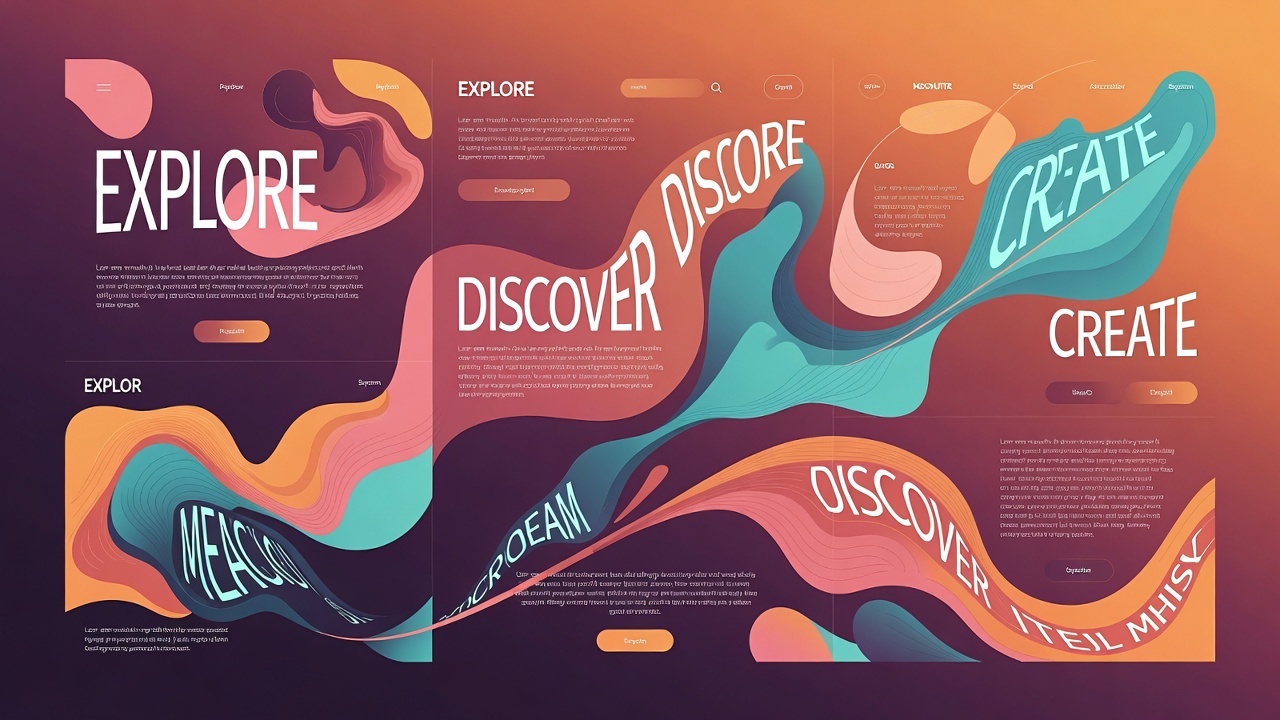
Tendencias de Diseño Web 2026: Lo que no puedes ignorar este año
1. Formas orgánicas, gradientes suaves y anti-grid: adiós a la rigidez
El grid perfecto y simétrico está quedando atrás. En 2026, las webs abrazan lo asimétrico y lo fluido: formas orgánicas (como blobs, ondas y curvas irregulares), gradientes que fluyen sin bordes duros y layouts que rompen la cuadrícula tradicional.
Por qué importa: Humaniza la experiencia digital en un mundo saturado de pantallas perfectas. Da sensación de calidez y creatividad.
Ejemplos prácticos:
- Fondos con blobs animados que responden al scroll.
- Secciones que se superponen de forma irregular.
- Menús que «flotan» o se deforman al hover.
Herramientas fáciles: Elementor o Framer para prototipos rápidos.
2. Elementos 3D inmersivos y WebGL accesible
El 3D ya no es lujo de agencias grandes. Con herramientas como Spline, Three.js y WebGL optimizado, cualquier sitio puede tener modelos 3D interactivos, rotaciones al scroll o fondos espaciales.
Tendencias destacadas:
- Objetos 3D que reaccionan al movimiento del ratón o al scroll.
- Transiciones inmersivas (ej. un portfolio donde tus proyectos «salen» de la pantalla).
- 3D ligero para no sacrificar velocidad (Core Web Vitals siguen siendo rey).
En 2026, el 3D se usa para storytelling: un diseñador puede mostrar su proceso como un tour 3D interactivo.
3. Maximalismo táctil: texturas, sombras reales y «toque físico»
Después del flat design, volvemos a lo táctil. Texturas reales (papel arrugado, tela, metal cepillado), sombras profundas, grain (grano de película) y efectos que simulan materiales físicos.
Variantes populares:
- Tactile maximalism: capas de texturas + colores vibrantes.
- Light skeuomorphism: botones que parecen presionables, con feedback háptico simulado.
- Frosted glass 2.0 (glassmorphism renovado con más profundidad).
Esto crea dopamine hits: el usuario siente que «toca» la web.
4. Navegación experimental y storytelling cinemático
Menús fijos y hamburguesas clásicas dan paso a navegación creativa:
- Scroll narrativo con secciones que se revelan como capítulos.
- Menús que se expanden con animaciones orgánicas.
- Cursor personalizado o interacciones basadas en gestos.
El sitio entero cuenta una historia: el usuario «viaja» por el contenido.
5. Colores vibrantes, dopamine y paletas «naturaleza destilada»
Adiós al neutro eterno. 2026 trae:
- Dopamine colors: neones suaves, rosas eléctricos, verdes lima.
- Nature distilled: tonos tierra con toques saturados (verdes musgo + acentos coral).
- Paletas maximalistas con contrastes altos pero accesibles.
Tip: Usa herramientas como Adobe Color o Coolors para probar combinaciones WCAG-compliant.
6. Tipografía exagerada y cinética
La tipografía ya no es estática:
- Kinetic typography: letras que se animan, deforman o responden al scroll.
- Exaggerated hierarchy: títulos gigantes, serif bold mezclados con sans ultra-ligeros.
- Playful letters: fuentes distorsionadas, con efectos glitch o handwritten imperfectas.
Combina fuentes variables para ahorrar peso y mejorar rendimiento.
7. Retro revival y museumcore: nostalgia con twist moderno
Vuelve lo retro:
- Estética Y2K + brutalismo suave.
- Museumcore: layouts como exposiciones de arte, con spotlight en elementos.
- Dial-up delight: pixeles suaves, cursors clásicos con modern twist.
Es nostalgia sin caer en lo kitsch: usa para portfolios creativos.
8. IA al servicio del diseño (pero humano al mando)
La IA genera layouts, paletas o assets, pero el toque humano es clave:
- Personalización agentic: sitios que se adaptan en tiempo real (contenido dinámico).
- Multimodal: voz + gesto + texto en experiencias híbridas.
- Diseños «imperfect by design»: grain, asimetrías intencionales para contrarrestar la perfección IA.
9. Accesibilidad first y performance obsesiva
Tendencias visuales locas, pero con reglas:
- Core Web Vitals por encima de todo (velocidad <2s).
- Modos emocionales (dark mode auto, high-contrast).
- Inclusividad: alt text IA, keyboard navigation, reduced motion.
Un sitio bonito pero lento = fracaso en 2026.
10. Sostenibilidad digital: menos es más (en código)
Hosting verde, código limpio, imágenes AVIF/WebP, lazy loading extremo. Los usuarios (y Google) premian sitios eco-friendly.
Conclusión: ¿Cómo aplicar esto en tu próximo proyecto?
2026 es el año de equilibrar lo wow con lo usable. Empieza pequeño: prueba un fondo orgánico en tu portfolio, añade una animación 3D ligera o juega con texturas táctiles en botones. El secreto es que el diseño sirva al mensaje, no al revés.
Y recuerda: para que estas tendencias brillen, necesitas un hosting rápido, con CDN global, PHP actualizado y uptime impecable. Un sitio con lags mata la inmersión. (Pronto compartiré mis recomendaciones favoritas para hosting en creativos y diseñadores).
¿Qué tendencia te emociona más para 2026? ¿Ya estás experimentando con 3D o maximalismo táctil? Déjame tu comentario abajo, ¡me encanta leer vuestras experiencias!
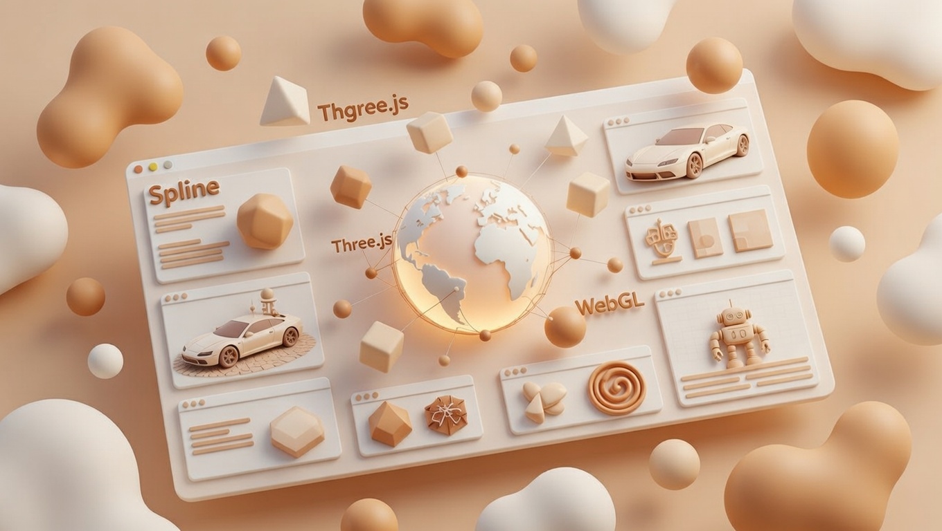
Las 3 herramientas clave para llevar el 3D interactivo a tu web en 2026: Spline, Three.js y WebGL
En 2026, el diseño web ya no es plano: los sitios con elementos 3D inmersivos, que reaccionan al scroll, al ratón o incluso a datos en tiempo real, son la norma en portfolios, landing pages y productos digitales. Pero ¿cómo crearlos sin volverte loco? Aquí van las tres herramientas más potentes y accesibles del momento: WebGL (la base), Three.js (el framework estrella) y Spline (el no-code que lo cambia todo).
1. WebGL: El motor nativo del navegador
WebGL es la API de bajo nivel que permite renderizar gráficos 3D directamente en el navegador, usando la GPU del usuario sin plugins. Es el estándar desde hace años (WebGL 2.0 es maduro y WebGPU ya está llegando fuerte en 2026 para más rendimiento).
- Pros: Máximo control y rendimiento nativo. Gratis y sin dependencias.
- Contras: Muy técnico. Escribir código puro WebGL es como programar en ensamblador: potente pero agotador.
- Cuándo usarlo: Si necesitas algo ultra-optimizado (juegos web complejos, visualizaciones científicas) o estás construyendo tu propia librería.
En la práctica, casi nadie usa WebGL puro hoy en día. Es la «tubería» que usan las otras herramientas.
2. Three.js: El rey del 3D programático
Three.js es la librería JavaScript más usada para 3D en la web (más del 95% de proyectos interactivos lo incluyen o lo usan indirectamente). Abstrae la complejidad de WebGL con un API amigable: escenas, cámaras, luces, materiales, animaciones, loaders de modelos (glTF, OBJ…) y soporte para sombras, post-procesado y WebXR (AR/VR).
En 2026, con WebGPU integrado en todos los navegadores principales, Three.js vuela en rendimiento: escenas con millones de partículas, iluminación global en tiempo real y shaders generados con IA.
- Pros: Comunidad enorme, ejemplos infinitos, integración perfecta con React (via React Three Fiber), React Native y frameworks modernos.
- Contras: Requiere código (JavaScript/TypeScript). Curva de aprendizaje media-alta si quieres cosas avanzadas.
- Cuándo usarlo: Proyectos personalizados, juegos web, dashboards de datos 3D o cuando necesitas control total (custom shaders, procedural generation…).
Si eres developer, Three.js es casi obligatorio en tu stack 2026.
3. Spline: El no-code que democratiza el 3D web
Spline es la estrella del diseño 3D colaborativo en navegador. Es una plataforma web-based donde diseñas escenas 3D con interfaz drag-and-drop (parecida a Figma pero en 3D), añades interacciones (hover, scroll, click), animaciones, eventos, variables y hasta conexiones a APIs o IA para generar assets.
Exportas embeds directos, código React o links para integrar en Webflow, Framer, WordPress… En 2026, con Spline AI ya maduro, generas variantes 3D en segundos y colaboras en tiempo real con tu equipo.
- Pros: Súper rápido para prototipos y producción. Ideal para diseñadores (no necesitas código). Interactividad potente sin JS. Exporta ligero y optimizado.
- Contras: Menos control granular que Three.js para cosas muy custom. Precio (plan Pro ~$12-20/mes, pero free tier sólido).
- Cuándo usarlo: Portfolios, landing pages, mockups de productos, sitios creativos… Básicamente, si quieres 3D wow sin contratar un dev 3D full-time.
¿Cuál elegir en 2026?
- Diseñador o marketer que quiere resultados rápidos → Empieza con Spline. En horas tienes algo inmersivo.
- Developer que ama el control y la personalización → Three.js (con React Three Fiber si usas React).
- Todo lo demás → Usa WebGL como base invisible (lo usan las otras dos).
Lo mejor: muchas veces se combinan. Modela en Blender → importa a Spline para interacciones rápidas → o pasa a Three.js para features ultra-avanzadas.
¿Ya estás experimentando con 3D en tu web? ¿Spline o Three.js? Cuéntame en comentarios, ¡me encanta ver qué estáis creando!
WordPress en 2026: Mi evolución con la IA y nuevos horizontes
 Llevo más de una década construyendo sitios con WordPress. Empecé con temas gratuitos y plugins básicos, luego pasé a temas personalizados, Divi / Visual Composer y estoy ahora aprendiendo sobre headless, ya que hoy en día el rendimiento de publicación en web es un elemento incontrovertible .
WordPress ha sido mi compañero fiel: flexible, con una comunidad enorme y un ecosistema que siempre encuentra solución para casi todo. Pero 2026 ya no es 2016. La inteligencia artificial ha entrado de lleno en mi flujo diario y, honestamente, me ha salvado horas de trabajo.
Hoy en día, cuando me encuentro en la situación de tener que dar soluciones a problemas y necesidades que me plantean mis clientes, acudo a Grok, ya sea para explicaciones en detalle o para conseguir código «en crudo» que me ponga sobre el buen camino.
Luego reviso, optimizo, corrijo, pruebo, y ajusto lo que la IA no captó del contexto real.
Es como tener a una versión «junior» de mí mismo, muy rápida y que nunca se cansa, que siempre te asiste con ingenio, pero que necesita supervisión constante para evitar caer en un código frágil o incompleto.
Cosas que no cambian… y otras que sí
Los lenguajes que siguen reinando son los de siempre: HTML5 bien estructurado (con ARIA y semantic tags), CSS moderno (con sus Media Queries, sus animaciones) y JavaScript/TypeScript para la lógica interactiva.
En cuanto a Frameworks, intentaremos en este Blog actualizarnos a nosotros mismos para ponernos al día. Me quedan por explorar Frameworks como React, Next.js, o Tailwind CSS.
Y luego todo el paradigma headless, que resuelve el problema de la multi-publicación en varios medios con un solo click: en una web normal, en una app móvil, en redes sociales o hasta en una pantalla inteligente.
Hoy en dia las empresas quieren que el mismo artículo o producto aparezca perfecto en 10 sitios distintos sin tener que copiar-pegar todo el rato.
Retos futuros
Pero no todo es color de rosa. Los retos siguen ahí: mantener la seguridad (WordPress sigue siendo el objetivo número uno de ataques), optimizar rendimiento en sitios con muchos plugins, y lidiar con la deuda técnica acumulada en instalaciones antiguas.
La IA ayuda con auditorías rápidas de código o sugerencias de optimización, pero no reemplaza la experiencia de saber cuándo un plugin es un lastre o cuándo vale la pena migrar.
Competidores de WordPress
Y luego están los competidores que empiezan a morder fuerte.
Hoy en día, WordPress sigue siendo el rey para la mayoría (es barato, fácil y tiene millones de plugins), pero ya tiene rivales fuertes, especialmente en el mundo headless o para necesidades específicas.
Algunos de los que más suenan en 2026 son Sanity (muy querido por desarrolladores porque es flexible y colaborativo en tiempo real), Contentful (ideal para empresas grandes que necesitan mucho control y muchas integraciones), Strapi (gratis y open-source, lo puedes instalar tú mismo y personalizarlo todo), Storyblok (genial para equipos de marketing y diseño porque tiene un editor visual muy intuitivo) y Webflow (no es exactamente un CMS headless puro, pero permite crear sitios muy bonitos sin código y con un CMS integrado).
Estos no reemplazan a WordPress en todo, pero para proyectos donde se necesita velocidad extrema, diseño personalizado o entrega en varios canales, cada vez más gente los elige.
Conclusiones
La IA no me ha quitado el trabajo; me lo ha hecho más interesante. Me obliga a pensar más en estrategia, en experiencia de usuario real y en integración inteligente. Ya no soy solo un “maquetador”; soy un director de orquesta que usa herramientas potentes (incluida la IA) para entregar valor rápido y duradero.
¿Y tú? ¿Cómo ha cambiado tu día a día con WordPress en estos últimos años? Cuéntame en comentarios, que me encanta ver cómo evoluciona esto.
Media Queries CSS: Las Principales Listas para Usar en 2026
En el mundo del desarrollo web responsive, las media queries son esenciales para adaptar tu sitio a diferentes tamaños de pantalla. Basado en estándares actualizados de 2026 (de fuentes como MDN, Bootstrap, Tailwind y guías de CSS-Tricks), el enfoque recomendado es mobile-first: para definir estilos base de los dispositivos más pequeños, y usar luego las media queries para pantallas más grandes. Esto optimiza el rendimiento y el SEO.
Los breakpoints comunes se basan en resoluciones populares: móviles (320-480px), tablets (481-768px), laptops pequeños (769-1024px), desktops (1025-1200px) y pantallas grandes (>1200px). Aquí te dejo ejemplos listos para copiar y pegar en tu CSS, con comentarios para claridad.
Ejemplo Básico Mobile-First
Estilos base para móviles, y queries para escalar.
/* Estilos base (para móviles < 480px) */
body {
  font-size: 14px;
  padding: 10px;
}

/* Tablets y móviles grandes (481px a 768px) */
@media (min-width: 481px) {
  body {
    font-size: 16px;
    padding: 20px;
  }
}

/* Laptops pequeños y tablets landscape (769px a 1024px) */
@media (min-width: 769px) {
  body {
    font-size: 18px;
    max-width: 960px;
    margin: 0 auto;
  }
}

/* Desktops medianos (1025px a 1200px) */
@media (min-width: 1025px) {
  body {
    font-size: 20px;
    max-width: 1140px;
  }
}

/* Pantallas grandes (>1201px) */
@media (min-width: 1201px) {
  body {
    max-width: 1400px;
  }
}
Usando Breakpoints de Bootstrap (Populares en 2026)
Bootstrap 6+ usa estos para sus grids responsive.
/* Extra small (xs) - Móviles <576px: estilos base */

/* Small (sm) - ≥576px */
@media (min-width: 576px) {
  /* Ajustes para móviles grandes */
}

/* Medium (md) - ≥768px */
@media (min-width: 768px) {
  /* Tablets */
}

/* Large (lg) - ≥992px */
@media (min-width: 992px) {
  /* Laptops */
}

/* Extra large (xl) - ≥1200px */
@media (min-width: 1200px) {
  /* Desktops */
}

/* Extra extra large (xxl) - ≥1400px */
@media (min-width: 1400px) {
  /* Pantallas grandes */
}
Breakpoints de Tailwind CSS (Rápidos y Modernos)
Tailwind es ideal para desarrollo ágil; sus defaults son estos.
/* Base: <640px */

/* sm: ≥640px */
@media (min-width: 640px) {
  /* Móviles grandes */
}

/* md: ≥768px */
@media (min-width: 768px) {
  /* Tablets */
}

/* lg: ≥1024px */
@media (min-width: 1024px) {
  /* Laptops */
}

/* xl: ≥1280px */
@media (min-width: 1280px) {
  /* Desktops */
}

/* 2xl: ≥1536px */
@media (min-width: 1536px) {
  /* Grandes */
}
Recuerda probar en emuladores como Chrome DevTools o herramientas como BrowserStack para ajustar según tu contenido. ¡No copies breakpoints a ciegas; elígelos basados en tu diseño real para un sitio fluido y accesible!